Having been blown away by what The Wolf Among Us had done for the point-and-click genre, I was ready for more of those games to impress me. I’d heard a lot of muttering about Face Noir, and after how much I’d loved the overall feel of the 1930’s era of games like L.A. Noire and Call of Cthulu: Dark Corners of the Earth, and given how excited I am for Contrast‘s coming release, I thought I’d have a really good time solving puzzles in that time. Little did I realize that, having played a game that got everything right in the genre, I was about to play a game that pretty much got everything wrong, pulling out every single aspect of the genre that I hated and creating a game from it. It’s developer, Mad Orange, has made a game that genre purists might really enjoy in Face Noir, but it does nothing for me.
You really can’t label something as noir without adding in some pretty overwrought dialogue. You can’t just say the night was dark, you have to say something like “It was blacker than the inside of a drowning man’s shoes” or something like that. It’s the kind of dialogue and description that I enjoy every once in a while, but it is also something that is extremely easy to screw up. You can go too far or pull up just short in how overdone it’s written, and I found a lot of the dialogue and descriptions in the game were written painfully badly. They do a decent job of it at times, but there were just too many instances where the writing came off as completely ridiculous, but not in the good way this genre needs. I was cringing almost any time someone opened their mouth to speak.
A big part of the issue was the speaking voices, though. Noir, as I said, is ridiculous in just the right way, but a lot of this stuff is a little too crazy to be said out loud unless you get someone with just the right voice and emotional power. For a good example in a game, look no further than James McCaffrey’s voice work in the Max Payne games. Some of the stuff he had to say was just too much, but he delivered it with such a power and confidence that it sounded good. He was making statements that no human being would ever say out loud, not even to themselves, but his delivery was just so spot on that I fell in love with the description and dialogue. The voice work in this game is not even close to his level of skill, speaking lines in an emotionless, flat way that makes the over-the-top nature of the writing sound absurd and terrible.

All of the voice acting is terrible, and in a game that has everything spoken out loud, this issue is unavoidable and constantly irritating. The main character, Jack Del Nero, is not the worst offender in the bunch, but the sheer amount of times he speaks meant his voice bugged me most of all. His lines are all delivered with the gusto of someone reading a radio ad for a small local business. There is no life to his reading, and everything sounds as if he’s as bored with the game as I am. The other actors don’t do much better, showing little ability to sound like human beings talking despite, presumably, being alive themselves. It somehow gets even worse when a Chinese cab driver is brought into the mix, as his painful dialogue and accent turned bad dialogue into something I’m embarrassed to be listening to. Having the w’s placed instead of r’s in all of his subtitles really didn’t help, either.
There’s a game somewhere under all of those complaints about the writing and dialogue, isn’t there? Well, that there is, and boy howdy does it sure love all the things I hate about point and click games. For starters, don’t choose to go with the 3D representations of the items. In the options, you can choose to activate a more graphically impressive version of the inventory that lets you see 3D representations of your items. It seemed like a strange thing to not have it as the default, so I turned it on, a decision I regretted. Instead of having your items lined up at the top of the screen, I had to go into a menu with the middle mouse button and click on the item I wanted. You’re not done there, though, as you have to go over to the new, large representation of the item, right click on it to switch from the default ‘look’ option over to the use option (because why would I be in my inventory to use an item, right?), and then exit the menu. Trust me, keep the original style. Hover near the top of the screen, select item you want, and you’re done. It’s so much better you’d wonder why anyone would take the time to program this other method.
Anyway, have fun finding the items you need to fill your inventory, because it’s pixel hunt time! Instead of making important objects stand out in the environment in a subtle way, everything just all blends together and you can hit F1 to highlight important items. I was about to say it’s a helpful addition, but it’s pretty much mandatory since many of the things you need to click on either blend into the environment perfectly or are so small you can hardly see them. You need to hit that button in hopes to make out the one brown box you can actually do something with out of all the others, or else you can always spend your time swooping all over the screen with your mouse pointer. It’s up to you, but I know which I preferred.

Puzzle solutions are pretty standard for the genre, requiring you do things like repair a phone with candy and things like that. Getting all of the parts you need can be a nuisance, as it is in most games of this type, but there were a fair amount of instances where things weren’t too hard to figure out. I actually managed to guess the solution sometimes based off of what I had in my inventory at the time, so the game does get some points for being straightforward in places. That’s only when you have some idea on what you’re supposed to be doing or fiddling with, though, as the game has an annoying tendency to dump you in an area where you’re not really sure what you’re looking for. Clicking around those highlighted items will eventually show you what to do, but I often wondered what I was even doing whenever I entered a room.
The game adds some more interactivity by having more intricate puzzles involved. The stuff isn’t a whole lot more complicated than the early Resident Evil games, but with added mouse control to make them feel more interesting than they actually are. There were some lock picking puzzles where you basically had to move your mouse back and forth until the lock clicked a few times, and at another point I had to mess around with some valves, placing them in the correct order so I didn’t overload some meters. Not bad, but again, bashing your head against the puzzle until you win is more Face Noir‘s kind of game.
Many of these puzzles devolved into turning dials and hitting buttons until they worked, and even in the lock picking puzzles, you’re pretty much just swinging the mouse around hoping the lock clicks enough times before it resets. For one puzzle, I had a list of frequencies and a few buttons to hit, and I had to get the right one in order to get a cop away from a spot I needed to get to. Did I have a clue which cop was the right one? No. So, I had to try out each frequency until I got a hold of him. The only method of solving this puzzle was just through trying everything, wasting my time when it could have been about finding the cop’s name and working with that clue.
The one interesting addition to the game’s puzzles was in having to put clues together in a kind of detective mode. The game’s background objects and papers all give you bits of information I initially discarded as flavor text, but soon that information became important. During some sequences, you’ll be asked to tie two pieces of information together to figure something out, like finding aaway of tricking someone into leaving you alone or to understand the logic behind a crime. The system is pretty neat, and made me feel a bet better about all the time I spent looking at objects I thought were pointless. It also required a bit of thought, something I liked a lot better than all of the fiddling puzzles the rest of the game was filled with. The right answer doesn’t always make sense, but overall it’s one of the few ideas in the game that I liked.

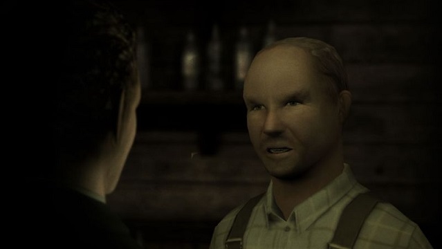
The game doesn’t look too bad. Locations are nice enough, although all of the brown realism of the rain-drenched city didn’t appeal to me all that much. They do a nice job of conveying the time period, with all of the darkness lit up by harsh, violent lights from the failing businesses, but having items hidden so well along the walls and floors stole a lot of the backgrounds’ visual charm. The characters are another story entirely, though, as they all look terrible. Almost all of them have doughy looks to them, as if they’re all suffering from their faces swelling up, and none of them seem to have any facial expressions beyond that of a ventriloquist dummy. Well, scratch that, as most dummies can at least convey surprise, and no one in this game does more than look vacant. I know this is an effort from an indie studio and that 3D character models might have been hard for them to do with a limited budget, but this is when a more stylized look for the game could have come in handy.
The character models don’t do all that much besides talk to each other, either, as most of the varied action sequences and activities are handled by static images. Now, these were some of my favorite parts in the Cognition: An Erica Reed Thriller series, but the still images in Face Noir are painted as if they’ve been taken directly from the 3D character models. Despite being painted images, the characters all look just as bad as they do the rest of the time, and it makes these scenes look terrible. Everyone seems to have had their lips burnt off in some horrible accident, their faces bulging and ghastly. Actions are also indicated in these scenes by simply switching pictures, so a character’s head might move from one position to another just by transitioning. At one point he’s looking forward, and the next he’s looking left. The game seems to forget this at times, though, and the image will switch back to an older one when it doesn’t make sense based on what’s being described.
The soundtrack initially seemed nice, too. There’s a lot of soothing tracks and sounds that are indicative of the era, even if the game does play them a bit too loud on its default settings. Turn that stuff down if you want to hear the characters comfortably (Or don’t, since subtitles do the job and the voice acting is awful). The issue is that the tracks don’t go any further beyond sounding like something you would hear during that time. The same tracks would play when I was being interrogated at the police station, when I was drinking at the bar, and when I was looking at a dead body by the harbor. None of it seems like it was assigned to improve the mood or tone of where you are or what you’re doing, and was just tossed in because it sounds right in the timeline. The music is pleasant, but grates on the ear since it really doesn’t feel like it fits anything but the time period.
Everything in Face Noir seems to aspire to functionality instead of elegance. Instead of being a good point-and-click game, it just does everything the genre has been known for without adding any fixes beyond the now popular item-highlighting trick. The game’s 3D graphics look terrible, but they do the job of showing you that human beings are talking to each other. The music is right for the period, but is tossed about without any thought of pacing or atmosphere. The puzzles involve some interactivity, but it’s mostly just turning things and trying options at random. There is no compelling reason to keep playing this game unless you’re somehow pleased with any one of its mediocre design and plot choices, something I can only see happening of point-and-click fanatics. Beyond that, avoid this game like 14 day old milk that’s been sitting in sunlight so hot even the Devil busted out his swimming trunks. Hey, I can do this noir thing too.
Face Noir can be purchased for $19.99 on Steam.


